
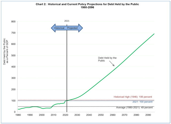

The U.S. Treasury Department has released an insane chart projecting U.S. debt-GDP ratio out to 2090.
The chart shows an almost linear increase projected ratio with debt-GDP reaching almost 700 percent by 2090.
The chart was flagged on Twitter by economic analyst Lyn Alden. Alden didn’t link to the original publication, and we couldn’t find it, but we thought the chart was worth sharing with Maine Wire readers.
Why does that matter?
The debt-GDP ratio is a measure used by political scientists and economists to evaluate the severity of a country’s public debt and its economic health.
The size of the country’s GDP, which is a measure of goods and services produced in the country, is a key factor to understanding whether that debt is likely to get paid down.
A higher debt-GDP ratio means it’s less likely the debt will be paid down, which in turn can impact the interest rate a country pays to borrow for further deficit spending.
For example, if the U.S. has a three or four trillion dollar debt, that’s less significant than if a tiny nation like Djibouti was carrying such a debt load.
The higher the number, generally speaking, the worse off a country’s economy. Though Modern Monetary Theory (MMT), an economic school with a growing body of subscribers, would suggest that the measure is ultimately meaningless because governments can create as much money as they please with virtually no ill consequences because any inflation can be sucked out of the private sector through taxation. (Seriously, people actually believe this.)
A World Bank study in 2013 found that countries whose debt-GDP ratios exceed 77 percent for prolonged periods tend to experience slowdowns in the growth of their economies.
The U.S. has been above that level since 2009.